


Fig. 3
Download original image
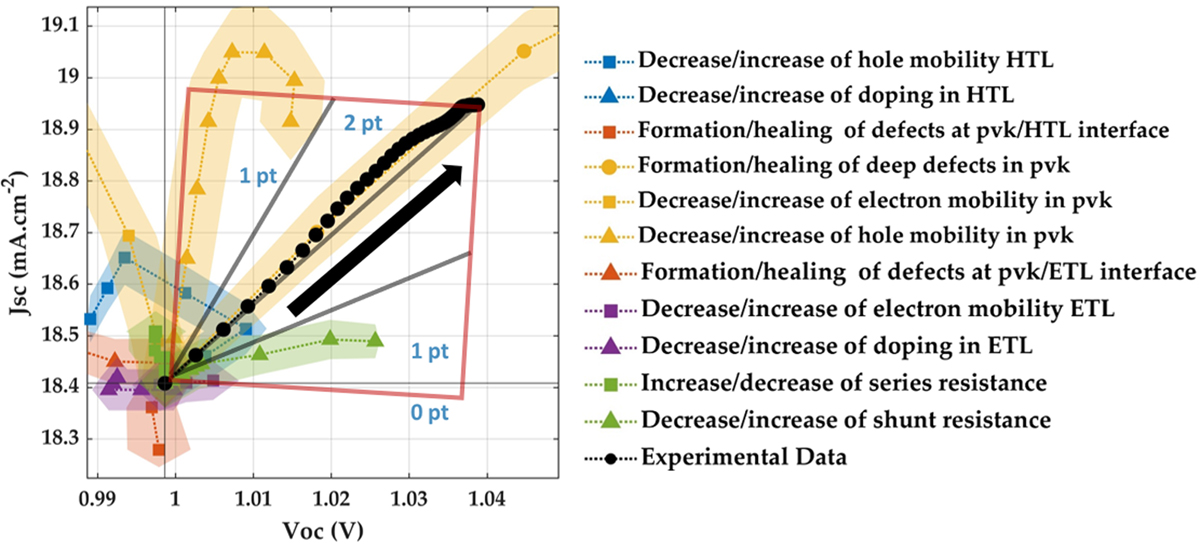
Illustrative correlation plot for LS1 of Cell 3.1 in terms of JSC vs VOC. The figure shows how experimental and simulated correlation pathways are compared within the proposed framework. Each simulated mechanism is averaged over ≈100 simulated devices and each coloured area represents a 95% confidence interval. For degradation, the same material parameters are varied in the opposite direction (e.g. defect healing becomes defect formation). The black arrow indicates the sense of performance increase, towards higher VOC and JSC. The full mechanism list is given in the legend, grouped by layer: yellow for perovskite, blue for HTL, purple for ETL, orange for interfaces, and green for parasitic resistances. The square and polygon drawn in the plot illustrate the scoring regions: trajectories within the polygon correspond to good agreement, those within the square but outside the polygon to moderate agreement, and those outside the square to poor agreement.
Current usage metrics show cumulative count of Article Views (full-text article views including HTML views, PDF and ePub downloads, according to the available data) and Abstracts Views on Vision4Press platform.
Data correspond to usage on the plateform after 2015. The current usage metrics is available 48-96 hours after online publication and is updated daily on week days.
Initial download of the metrics may take a while.