Fig. 3
Download original image
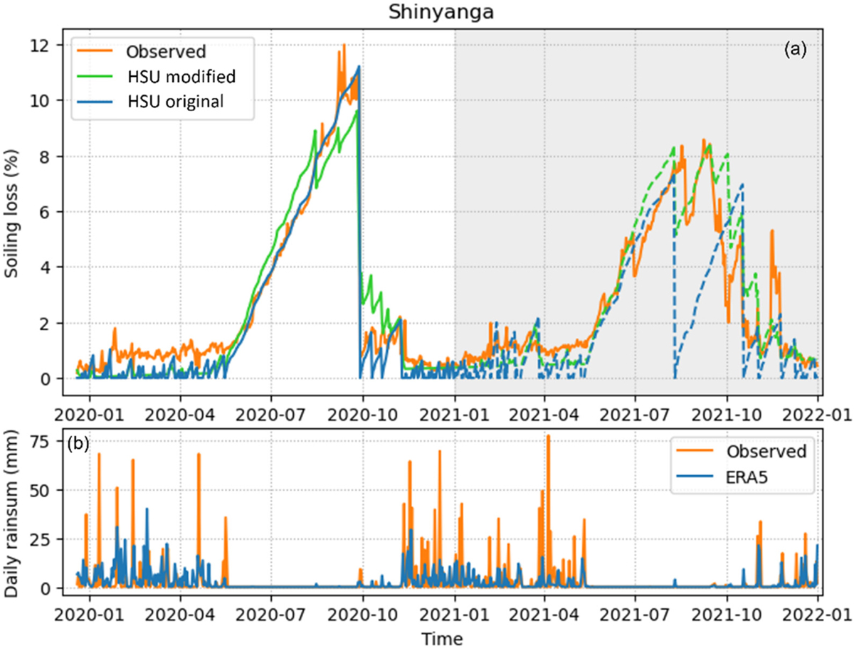
(a) Model optimization for the mostly removable soiling type observed at the Shinyanga station. The blue line shows the time series of soiling losses produced with the calibrated original HSU model, whereas the green line corresponds to the modified HSU model. While the training period is indicated with a white background and solid lines in panel (a), the shaded background and dashed lines correspond to the validation period. The observed soiling losses at Shinyanga are depicted by the solid orange line across the entire campaign period. Panel (b) shows the observed daily rain sum (orange line) at the station, as well as the corresponding ERA5 values (blue line).
Current usage metrics show cumulative count of Article Views (full-text article views including HTML views, PDF and ePub downloads, according to the available data) and Abstracts Views on Vision4Press platform.
Data correspond to usage on the plateform after 2015. The current usage metrics is available 48-96 hours after online publication and is updated daily on week days.
Initial download of the metrics may take a while.