Fig. 6
Download original image
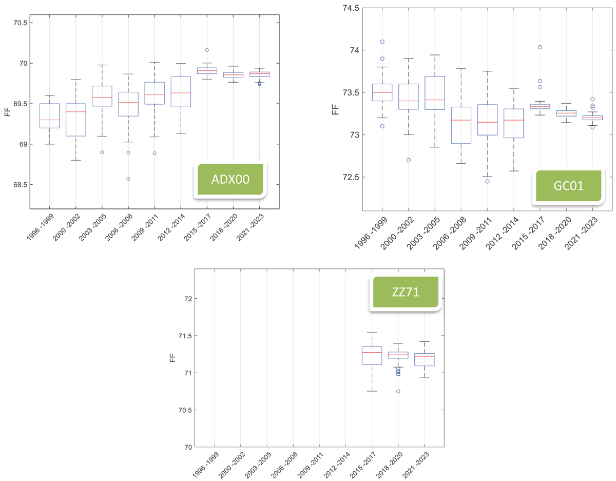
Box and whiskers plots of the FF data sets split into the same periods of 3 years each. The box represents the interquartile range, which is the range containing the middle 50% of the data. It extends from Q1 to Q3. The horizontal line inside the box represents the median (50% percentile). The whiskers extend to the most extreme data points not considered outliers, while the outliers are plotted as points outside the whiskers.
Current usage metrics show cumulative count of Article Views (full-text article views including HTML views, PDF and ePub downloads, according to the available data) and Abstracts Views on Vision4Press platform.
Data correspond to usage on the plateform after 2015. The current usage metrics is available 48-96 hours after online publication and is updated daily on week days.
Initial download of the metrics may take a while.