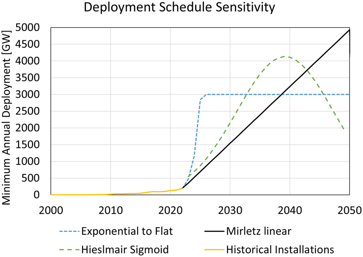
Fig. B.4

Download original image
A graph comparing the three minimum annual deployment schedules modeled with the 13 scenarios to assess the robustness of the results to the rate of deployment. The black line is what is used for the results presented in the body of this work. The green is sourced from Hieslmair based on a sigmoidal adoption. The blue follows a 3 year exponential increase to 3 TW then holds constant through 2050. These represent the minimum annual deployment; replacements to maintain capacity are calculated for each scenario based on lifetimes.
Current usage metrics show cumulative count of Article Views (full-text article views including HTML views, PDF and ePub downloads, according to the available data) and Abstracts Views on Vision4Press platform.
Data correspond to usage on the plateform after 2015. The current usage metrics is available 48-96 hours after online publication and is updated daily on week days.
Initial download of the metrics may take a while.


