Fig. 4

Download original image
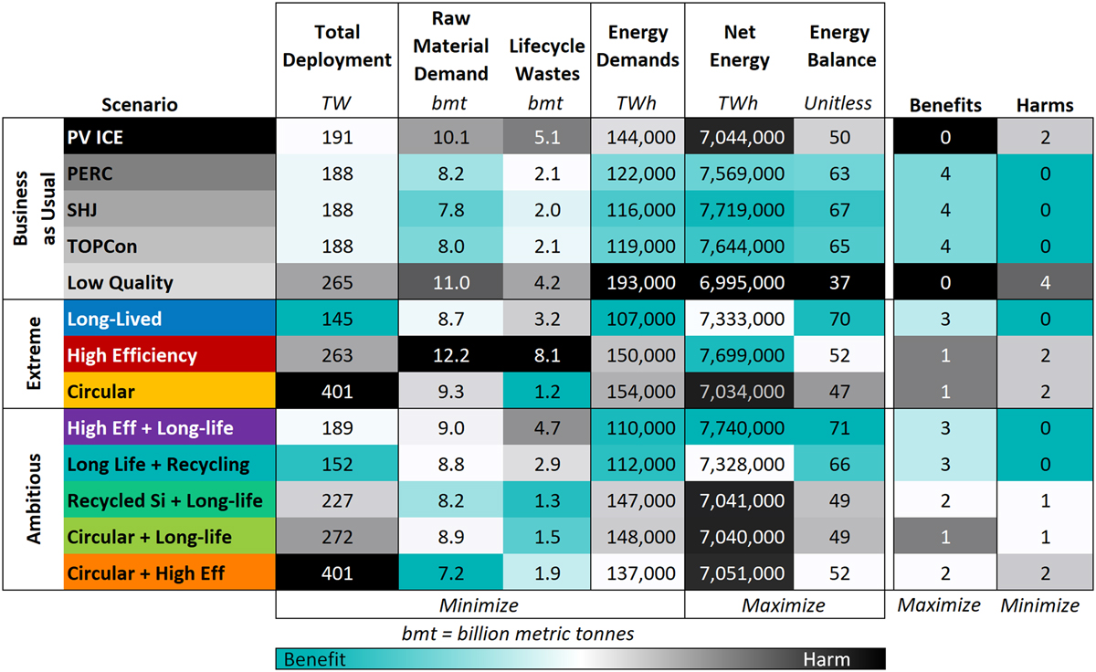
A comparison of the PV module design scenarios (rows) across the six mass and energy metrics (columns). The first 4 metrics should be minimized while the last two metrics should be maximized. The numbers in cells are the cumulative result in each metric for each module scenario, rounded to 3 significant figures. The color scale (teal to black) is proportional to the range of results within each metric; most intensely teal is the best performing while black is the worst performing module scenario. Two final columns, Benefits and Harms, summarize module scenarios by counting the number of intensely teal or black metrics for each module scenario, and are color ranked from 0 to 6 (the number of metrics). This comparison matrix highlights tradeoffs between mass and energy metrics within module designs, and emphasizes that increasing lifetime increases benefits while minimizing harm.
Current usage metrics show cumulative count of Article Views (full-text article views including HTML views, PDF and ePub downloads, according to the available data) and Abstracts Views on Vision4Press platform.
Data correspond to usage on the plateform after 2015. The current usage metrics is available 48-96 hours after online publication and is updated daily on week days.
Initial download of the metrics may take a while.


